Quantcast
Channel: The Pen Addict
Viewing all 4319 articles
Browse latest View live

Monteverde Artista Crystal Fountain Pen Review

$
0
0
Monteverde Artista 1.jpg

Let me tell you about the second fountain pen I bought -- The Monteverde Artista Crystal -- with a transparent body. First off, I didn't really know a Lamy from a Pilot. I was just interested in all the pens. My personal taste hadn't developed yet, and I was open to anything new that crossed my path. The Monteverde did just that one day on JetPens when I was browsing. It had been a rough week, so I made an impulse decision to reward myself. You do that too, right?

My first impressions of the pen were very positive. It came in a nice box and wrote like a dream instantly. I've had the pen for over a year now, and it still surprises me by how pleasant it is to use.

The appearance of the pen isn't very special when you see pictures of it online. It's much more striking in person. It's smaller than you might guess -- The same length as a Retro 51 when it's capped. Because of the size, I typically write with this pen posted. That seems to give it the perfect weight for my hand. The chrome accents set the pen off and make it look more professional than other demonstrators in the price range.

Monteverde Artista 3.jpg

One of the things I noticed right from the start was the transparent feed. All of the other fountain pens I use have black or dark colored feeds. I was delighted to see the feed change colors as the ink absorbed into the feed along the tiny channels.

The nib is one of my favorites that I own. Keep in mind, I have a limited collection, and I'm sure there are much better nibs out there, but I really enjoy this nib. Writing is smooth, flow is consistent, and line width variation is subtle. When using a blue or lighter ink like Kon-Peki, you can see how the nib behaves with different strokes.

My only complaint is that sometimes the flow seems to dry up and the only way to fix it is to twist the converter a bit to force the ink into the feed. I'm not sure if this is a fault in the converter or the feed because I've never used any cartridges with this pen. It's a minor problem, and it hasn't bothered me enough to do any more research or troubleshooting.

Monteverde Artista 4.jpg

Because of the chrome accents, the part of the pen that I grip (the part closest to the nib) has a nice weight to it. Plastic pens are usually very light, but this pen has good weight in the right place. The chrome accent on the converter is also a nice touch, since it's a demonstrator body.

Cleaning this pen is extremely easy because it completely disassembles. The nib unit unscrews from the body, and then the feed unit separates from the nib. The converter also disassembles completely, which makes cleaning and drying much quicker.

Monteverde Artista 2.jpg

To sum it all up, this is a good pen. Now that I own more fountain pens, I don't know that I would buy one of these after just seeing a picture online. But I think I'd be missing out if that were the case. A major con for me was that only one nib size is available (medium). I don't mind so much now -- it's part of the pen's personality. The only other con is the price, but I think the sub-$40 range of this pen is fair for the quality of materials and the experience.

The Monteverde Artista Crystal is available on JetPens in four colors, but I think transparent is the right choice.

Monteverde Artista 5.jpg

Ink Links

$
0
0

Last day to enter the latest Pen Addict + Huckberry giveaway - do it!!!

-- Olive Wood! Graf von Faber-Castell Elemento (these beautiful pens)

-- Noodler’s Navy – Ink Review | (Ed Jelley)

-- Ink Samples and Anderson Pens (Inkdependence!)

-- Chris Williams' Minimalist Brass Hi-Tec-C - Pen Review (The Clicky Post)

-- Word. Notebook (East...West...Everywhere)

-- Rotring Newton Fountain Pen (No Pen Intended)

-- Rotring Renaissance Piston Filler Fountain Pen (Write to Me Often)

-- 12 Days of Inkmas: Private Reserve Orange Crush (The Well-Appointed Desk)

-- Kaweco Fountain Pen Nib Comparison (Gourmet Pens)

-- Double Ended Pens - An Update (Edison Pen Company)

-- The Bolt in Action – My trip to Karas Kustoms and a Review (Inktronics)

-- Teal and Purple Friday: ACME Crayon Rollerball in New Colors (From the Pen Cup)

-- Canson 180° Sketchbook Review (Notebook Stories)

-- ForestChoice Notebook Environmentally Friendly Hardcover Notebook (Office Supply Geek)

-- Faber-Castell e-motion fountain pen review (Pens! Paper! Pencils!)

-- Diamine Meadow (Informal Scribble)

-- japanese refills (for the pentel color brush) (a cartoonist in Kekionga)

-- Drawing Tools (Drawsigner)

-- Midori World Meister’s Note Vol. 1 “Dainel” Notebook Review (THE UNROYAL WARRANT)

Huckberry Pen Project Giveaway Winner

$
0
0

Awesome stuff again from my friends at Huckberry! Thank you for sponsoring this great giveaway and I hope everyone got the chance to explore just how cool Huckberry is.

The winner of The Pen Project and Word. Notebooks is:

Huckberry.JPG

Congrats David! Get in touch with me via the Contact page and I will arrange your goods with Huckberry. You have one week to claim your prize.

Thanks again to Huckberry for this great giveaway. There aren't many shopping days left folks!

Esterbrook J Fountain Pen Review

$
0
0
Esterbrook Capped.jpg

(This is a guest post by Garrett Kubat. You can find more from Garrett on Twitter @gazkubat.)

The Esterbrook J is my first vintage fountain pen. Of the pens that I own it is one of the most consistent workhorses that I can rely on to write. It writes when I need it to and only stops when the nib leaves the paper. The reliability is a huge plus in this vintage fountain pen. Reliability means that it can go from a novelty item to something that can be used every day. My estimates put this particular fountain pen to have been manufactured around 1948. I came to this conclusion by the fact the pen and lid both have the black plastic "jewels" on the ends. If someone more knowledgeable than I has a more accurate estimate I would be glad to hear it.

I purchased the pen from Brian and Lisa Anderson on their wonderful website for $60.00. They had others for sale that were cheaper, and I had read that eBay regularly sold them for even around half the price, but I was smitten by the blue colour and how I knew it would be a functional pen. Pens are beautiful, but I would rather have an ugly pen that wrote than a gorgeous one that didn't. That being said I was able to have the best of both worlds with this pen. This particular pen seems to be in a near flawless condition with no worn spots or scratches.

Esterbrook Clip.jpg

I would credit Brian and Lisa with the exceptional restoration I assume this pen received, but the state of the pen also speaks to how well these pens were made. They were made to be an affordable pen that used cheap but durable materials and were solidly crafted. It feels durable and write consistently, just like another amazing pen: The Lamy Safari. There are obvious differences but the two greatest similarities are they are long-lasting and reliable.

One element that makes this pen unique amongst the pens I own is the filling mechanism. Within the pen is an internal sack that can be depressed by the lever on the barrel of the pen. When the sack is depressed and the nib placed in ink all you do is push the lever back flush with the pen and allow the ink to flow into the pen. The ink capacity is not up there with say a TWSBI but it holds enough that I am not worried about running out of ink if I take the pen with me for the day.

Esterbrook 9556 Nib.jpg

This is an excellent choice to begin the vintage fountain pen journey with. The pens come in a variety of colours as well as other models like the LJ (Full length but slimmer than the J) and the SJ (shorter and thinner than the J). They can be found at a relatively affordable price and the large amount of nibs available makes these extremely versatile. An extensive list is available on Esterbrook.net, which is managed by the aforementioned Brian Anderson. I only have the 9556 (Fine Writing) and the 9555 (Gregg Shorthand) but I would love to get my hands on a stub nib.

This is my only vintage fountain pen so I can't compare it to others but I would say it stacks up well to a Lamy Safari, it was made to last and (most importantly) write.

Esterbrook ProsCons.jpg Esterbrook Writing Sample.jpg

Ink

$
0
0
Ink.jpg

My friend Dan Bishop and the gang at Karas Kustoms are back at it again. Monday marked the launch of their latest Kickstarter campaign - simply called Ink - which features a machined aluminum rollerball or fountain pen in a rainbow of barrel colors. Finally, a fountain pen worth backing on Kickstarter!

Dan was nice enough to send me an aluminum prototype model to check out, and I am impressed. The barrel shape is a huge winner in my book, with the size and diameter of classics like the Nakaya Piccolo and Edison Pearl. Beauty in simplicity I say.

Despite the size, the Ink is far from too heavy to write with. It has some weight to it, but the aluminum barrel is balanced so well that writing is effortless with the cap unposted. When capped, the extra heft gives this pen an indestructible feel that works as well in your jeans pocket as it does in your suit pocket.

Ink

L to R: Karas Kustoms Ink, Edison Pearl, TWSBI 580

The choice of a medium Schmidt #5 nib was a good one, giving this pen a solid foundation to lay down ink, plus some choice for those who like to tinker and may want to swap it out for a different size or other compatible nib (Note: I tested my TWSBI and Kaweco nibs and neither fit.) It is a firm, smooth writer and I have had zero issues with ink flow in the few days I have had this pen inked with Noodler's 54th Massachusetts.

The coup de grace in parting me with my money is the ability to back different color barrels at launch. The orange Render K is still my single favorite Karas Kustom pen, and an orange Ink will be joining it soon. And maybe black. Or blue. Or grey. And maybe a rollerball model because it fits my favorite Retro 51 refill. The options on this campaign are fantastic and it was hard to limit myself to one. Addicts have budgets too, right?

Check out Ink on Kickstarter. It's a great pen by great people and would make an excellent addition to any writing arsenal. Thanks to Dan for giving me an early look at was is sure to be Karas Kustoms best pen yet.

(P.S. Video. Is. Amazing.)

The Pen Addict Podcast: Episode 85 – Getting Ink With Dan Bishop

$
0
0

Myke and I were joined by our friend and machined-pen designer extraordinaire Dan Bishop from Karas Kustoms. Dan’s latest Kickstarter Project is a stunner and we were happy to have him on to discuss it. Myke also dove head first into Pelikan ownership and talked about an interesting notebook he received from a listener.

Show Notes & Download Links

Pilot Kakuno Fountain Pen Review

$
0
0

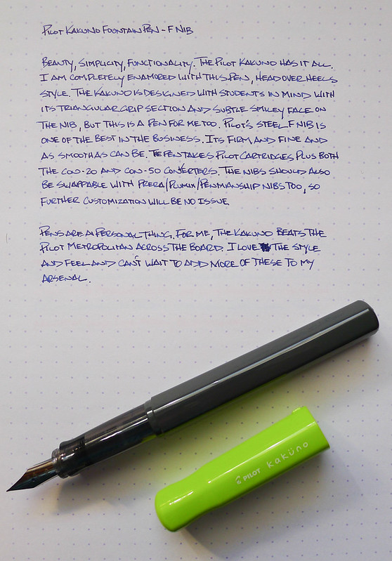
Pilot Kakuno

What is the best fountain pen for beginners?

I get this question all the time. My stock answers are the Lamy Safari and the Pilot Metropolitan but of course the real answer is "it depends."

The Pilot Kakuno will be joining - and maybe even replacing - the pens mentioned above as one of my favorite fountain pens for beginners.

Instagram has been a great resource to see what pens are hitting the Japanese market before makng their way to the US market, and pictures of the Kakuno have been popping up in my feed for months. I was in love with the simplicity of this pen before even getting my hands on it, and now that it is here I love it even more.

Let's be clear about one thing up front: The Kakuno is marketed towards school children in an effort to learn how to hold the pen properly and help improve their penmanship. Lamy did the same thing in the ABC fountain pen with their now commonplace grip design.

Pilot Kakuno

Marketing aside, this pen is for anyone who can appreciate great design and excellent performance. The plastic barrel and cap feature a hexagonal shape to keep the pen from rolling off the desk, with an added bump on the cap if the pen starts to get away from you. There is also a groove in the cap to help with removal.

The nib is standard Pilot quality. For those not playing the home game, standard Pilot quality is code for awesome. The F nib in my pen performs identically to other Pilot nibs found in the Prera and the like. It's fine, firm, and consistent. I'm assuming it is also swappable with other sizes (like the EF in the Pilot Penmanship or italic in the Plumix) but I haven't tried yet. I'm having too much fun writing with it as-is!

Pilot Kakuno

If there is any "gotcha" with this pen it is that there is a smiley face on the nib. It is there so kids know when they see the face they are holding the nib in the right direction. I thought it might detract from my use of the Kakuno but it is barely noticeable from a normal writing distance. Besides, what is more fun than a smiley face nib?

I see the Kakuno becoming a staple in Pilot's lineup, even moreso than the Metropolitan. The barrel is a blank slate, calling out for a huge range of colors and designs, and likely even some Japanese marketing tie-ins which are popular. Pilot could take this anywhere, especially with such a strong price point and the ability to use Pilot's ink converters.

For me, I'm taking it everywhere. It is highly portable, fun to look at, comfortable to hold, great to write with and downright cool. There is no doubt I will be adding more to my collection.

Pilot Kakuno

Noodler's Heart of Darkness review

$
0
0
Noodlers Heart of Darkness 2.jpg

The "Heart of Darkness" conjures up alluring yet terrifying visions in my mind of being lost in an imperceptibly dense and living jungle labyrinth. Luckily for us, we're only talking about a fountain pen ink and not Joseph Conrad's depiction of the African wilderness.

Noodler's Heart of Darkness is my staple black ink for all my pens. You could call it my sweetheart ink, but that might be taking it too far. If a better looking black ink comes by, my loyalty will quickly vanish.

What is there to say about a black ink? Every black ink I've tried is similar. This is why it's so much fun to experiment with other color inks -- they have unique and beautiful properties that just don't exist in a black ink. But even though black can be "boring," it's also a beautiful thing in its own right. So, how does it differ from the other black inks out there?

In my experience, Heart of Darkness plays nicely with all types of paper. Sure, it will bleed and feather a tad on cheaper, thinner paper, but that's expected. It's a very lubricated, smooth ink, which is something I hear often about Noodler's in general.

The ink dries quickly in most cases. It took a bit longer to dry on my Rhodia notebook because of the paper properties. There's no shading qualities to speak of, and I had a difficult time producing any line variations. It also has a matte look once dried.

The main reason I like this ink and always come back to it is the color. It's a deep, deep black. Some of the black inks I've tried have hints of gray or brown in them. This ink is black like a moonless night in the African jungle (at least in my imagination). I've also found that it's extremely friendly when it's time to clean out your pen.

Another positive note about this ink is that it has no smell that I can detect. Both Pilot and Sailor black inks that I use have a very distinctive odor that I don't really enjoy.

Overall, this is an excellent black to keep on hand for when you need a solid, dark black ink.

Noodlers Heart of Darkness 1.jpg Noodlers Heart of Darkness 3.jpg

Ink Links

$
0
0

-- Sheaffer 300 Fountain Pen Review (My Pen Needs Ink)

-- Between Parker and Waterman (Crónicas Estilográficas)

-- Pilot Precise Rolling Ball Extra Fine Review (THE UNROYAL WARRANT)

-- Monologue Ruled Notebooks (economy pens)

-- Ti-Click Classic in Raw Titanium - Kickstarter Pen Review (The Clicky Post)

-- Review: Delta Titanio Galassia Fountain Pen (Gourmet Pens)

-- A perfect marriage: Kaweco AL Sport and my pliers holder (Noble Ignitus)

-- InkDependence.com's First Give-Away! (Inkdependence!)

-- Writing with a Hero 9018 Fude Nib – Video Post (Ed Jelley)

-- Field Notes Cold Horizon Review (OfficeSupplyGeek)

-- The Standard Memorandum. Does It Compare to the Real Thing? (Inktronics)

-- Review: Hobonichi Planner 2014 (The Well-Appointed Desk)

-- Top 10 of 2013 (A Penchant for Paper)

-- Nibs in a box (Palimpsest)

-- Pelikan Edelstein Amber ink review (Pens! Paper! Pencils!)

-- A Plannerisms Going Places Planner (An Inkophile's Blog)

-- Uniball Signo 0.38mm (JoshMitch)

-- Scout Books Mega DIY Notebooks- Review (design concussion)

-- Noodler’s Walnut (Informal Scribble)

-- Pentel Side Clickers (My Supply Room)

-- Pilot Iroshizuku Ama-iro Ink Review (Write to Me Often)

Testing: The Hobonichi Planner Cover by Nock Co.

$
0
0

I am fortunate to work with an amazingly talented person in the form of my Nock Co. co-founder Mr. Jeffrey Bruckwicki. What he lacks in the surprise category ("I'm making you a cover for that thing for Christmas") he more than makes up for it in design and manufacturing skill. The guy has seriously got it.

To get him started, he outlined the shape of my Hobonichi Planner 2014 on a piece of paper. And that was it. About two days later I had a picture of the shell, and the day after that it was done. This is in his spare time, mind you, after working his day job and putting in long hours behind the machines for the Nock Co. Kickstarter project. To say I am impressed is an understatement.

To post this here is almost unfair because this is the only one Jeff is making...at least for this year. Maybe for the 2015 release if there is enough interest, but ordering a Hobonichi Planner from Japan is a hurdle for many people. Regardless, I just wanted to show off what Jeff came up with in a manner of hours because it blew my mind.

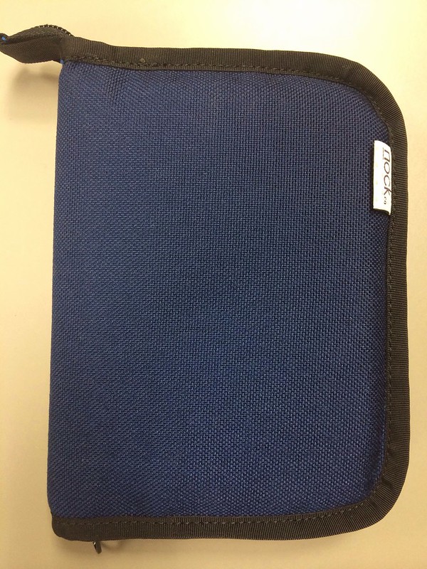
Hobonichi Planner Cover

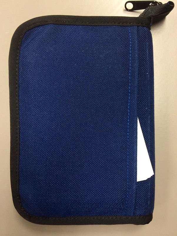
The front cover is simple, just how I like it. Jeff used Midnight Blue Cordura with black binding and a zip enclosure for added protection with a pull tab to assist with zipping and unzipping.

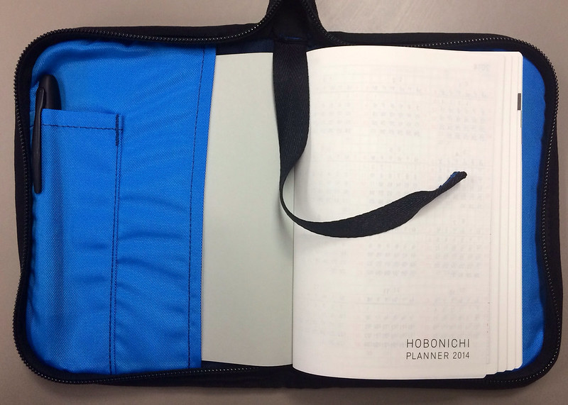
Hobonichi Planner Cover

The innards are where this cover really stands out. The cover of the Hobonichi Planner slides easily into front and back slots to keep the book safe and stable, and there is a pen pouch on the front side which can hold a couple of your favorite writing utensils. A bookmark is stitched into the top so you can quickly access the current day in your planner.

Hobonichi Planner Cover

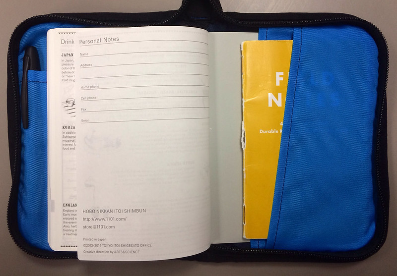
Party in the rear! Jeff snuck in a horizontal pocket in the back, perfect for loose sheets of paper or your favorite memo book. Did I mention the liner is the Blue Jay from our Kickstarter campaign? It is, and it is my favorite.

Hobonichi Planner Cover

One last sneak attack on the backside with another horizontal pocket. Perfect for index cards. I wonder if anyone will be releasing new index cards next year to fill these pockets? Hmmm...

This design nailed any and every high point I could think of. The funny thing is I didn't have to think of any. Jeff was in my brain and knocked this design out of the park.

The future is bright, folks.

For a full review of the Hobonichi Planner be sure to check out Ana's review at The Well-Appointed Desk.

The Pen Addict Podcast: Episode 86 - We Have Bingo!

$
0
0

Mike Dudek of The Clicky Post joined Myke and I for a rollicking episode of The Pen Addict Podcast. We have fun with a user-created Bingo card for the podcast before getting into the nuts and bolts of what makes Mr. Dudek tick. We also get schooled on buying out of production rOtring pens, causing Myke newfound pain in his wallet.

Show Notes & Download Links

Frictionless Tools - Capture Cards and Planning Pad

$
0
0
Frictionless 1.jpg

The Frictionless Tools offered by Aaron Mahnke of Frictionless (also another co-host on the glorious 5by5 network) are in the same vein as other planning products, such as the Emergent Task Planner. Even though they're similar, the Frictionless Pad is much more open-ended and versatile, which is a huge benefit when you need some thinking space or aren't sure what kind of meeting you're about to walk into. Aaron also sells a smaller version of the pad and Capture Cards, which are gorgeous index cards. We'll get to those later.

Frictionless 2.jpg

First, let's take a detailed look at the Planning Pad. Truly, you can make this pad do anything you want. Most of the time, I use the left gray column to serve as a timeline for the day. I list out the hours and start planning my tasks and events. But the beauty of the blank template is that I could also purpose this as a long task list, a grocery list, or a margin for notes and comments in relation to the writing in the large white block to the right. The possibilities are endless.

The top of the sheet has boxes for a date and subject (and again, anything else you want), which is helpful for providing context later or when it's time to file it away.

Finally, there's a large gray box at the bottom of the sheet that extends from left to right. Again, this could be used for anything you need. Who am I to tell you what to do with it?

I think Aaron says it best on the product page:

I designed them for myself because I wanted a small amount of structure, and a whole lot of freedom.

A beautiful and useful balance of structure and freedom.

The pad contains 50 8.5x11" sheets that easily tear away. The site doesn't detail the paper used in the pad, but it's good stock. Since there are colors on the sheets (gray and red), you can expect inks to behave a little differently depending on the area you're writing on. I found that the white areas are more absorbent and create a thicker line, but the shaded areas are less absorbent. All things considered, the paper does incredibly well with all types of pens. I tried all types and was pretty happy with the results.

Frictionless 3.jpg

For my personal preferences, I'd stay away from fountain pens larger than a fine nib. If it was a contest, gel inks would win on this pad. If I had to guess, I'd say Aaron is partial to micro-tip gel pens, which perform fantastically. My Sailor High Ace Neo is my favorite fountain pen for this paper.

The paper is a little grippy, which is good. If you have a fountain pen that likes to dig, this might be problematic. Just write lightly. Overall, this is great paper that is a pleasure to use.

Now, on to the Capture Cards.

Frictionless 4.jpg

These are my favorite index cards. The stock is heavy, but extremely smooth. All of my pens feel smoother and frictionless when writing on these cards. They have a similar layout, but even less structure. There are a couple of boxes on the top of the card (gray and red or gray and green), and a small gray box at the bottom. The white mid-section is full of a light grid. The back of the card also has the grid and a couple of small boxes on the top and bottom portion of the card. So simple and so effective.

When I write on these, they make me smile. When I hand these to people with notes on them, it makes them smile and ask about them. Luckily, there's some small branding on both the cards and the pad for people who want to know more.

Frictionless 5.jpg

If grid paper and awesome index cards are in your interest zone, give the Frictionless Tools a try. I've been very pleased (especially by the Capture Cards) and plan on buying more when I run out. Although, I'd probably go for the smaller Planning Pad next time to see if that size suits me better.

(You can find more from Jeff online at Draft Evolution, Twitter, and App.net.)

Ink Links

$
0
0

-- Pelikan M215 (Ionsomnia)

-- Ink Review: Pilot Iroshizuku Yama-Budo (Crimson Glory Vine) (The Pen Habit)

-- Curiouser and Curiouser: A Short Review of Diamine Salamander Ink (A fool with a pen)

-- ACME Studio Inc "Hatch" Roller Ball - Pen Review (The Clicky Post)

-- Pilot Custom Enju (2013) (kmpn)

-- Fallink in love again (Danny Gregory)

-- 2013 – The Year In Review(s) (Ed Jelley)

-- Best of A Penchant for Paper 2013 (A Penchant for Paper)

-- Annual 2013 Top Ten List of Popular Reviews (OfficeSupplyGeek)

-- Best BIC Student Pack Ever (My Supply Room)

-- Fountain Pens and Inks, Part 1 (Dannyboy Writes)

-- Pilot Decimo Fountain Pen: Capless Wonder (The Daily Acquisition)

-- Sailor Sapporo (aka Pro Gear Slim) (That One Pen)

-- Review: Sheaffer Taranis Fountain Pen (Gourmet Pens)

-- Overview of Word. The Standard Memorandum (East...West...Everywhere)

-- Sailor King of Pen Emperor Crown Fountain Pen (Write to Me Often)

-- Hobonichi Techo Planner Review (OfficeSupplyGeek)

-- Doane Paper Flap Jotter Notepad – Review | (Ed Jelley)

-- Review: Karas Kustoms Ink Fountain Pen (The Well-Appointed Desk)

-- Best Pens For 2013 (My Supply Room)

-- Listening while you write (My Pen Needs Ink)

-- Pilot Plumix fountain pen review (Pens! Paper! Pencils!)

-- TWSBI Mini (That One Pen)

-- Cartier Cabochon Desk Diary Review (THE UNROYAL WARRANT)

-- Everyday Commentary (Field Notes Pitch Black Review)

-- Stipula for Mercury: Francois des Trixhes (these beautiful pens)

-- Ink Drop Soup: Expensive Fountain Pens Just 30 and Below (No Pen Intended)

Diamine Bilberry Ink Review

$
0
0

Diamine Bilberry

The Bilberry is a wild-growing fruit found mainly in northern and central Europe and is a close relative to the blueberry found in North America. It is also the name of an extra-funky fountain pen ink made by Diamine.

While the ink is sometimes referred to as Bilberry Blue, in my short time with it I have found it to be distinctly purple. An electric purple at that. Breakin' 2: Electric Purple Boogaloo.

Like most Diamine inks I have used, Bilberry is well behaved. The color is rich, the shading is nice, and in this particular case there is a slight sheen left behind which you can see in the image below. Dry time is nothing special - average at best on my Rhodia DotPad.

When I did the handwritten part of the review I was enamored with the ink. I still am, but I haven't found it to be an every day go to ink like I thought it might be. Still, it is nice to have around and I thank Thomas for sending me this sample.

You can pick up a bottle of Diamine Bilberry at JetPens for $12.50.

Diamine Bilberry

As an added bonus, here is Bill Berry back on drums with some of his R.E.M. bandmates at Peter Buck's wedding this summer:

The Pen Addict Podcast: Episode 87 - Putting A Pen Out To Pasture

$
0
0

It was one of those "run the gamut" episodes of the podcast where Myke and I hit on a bunch of topics. Myke got a beautiful new pen while having to make the tough decision to retire one of his daily writers. Maybe the feel of lava will sooth him. I heap praise on one of my favorite new pens, the entry-level Pilot Kakuno and discuss some interesting ink performance with the Field Notes Cold Horizon edition.

Show Notes & Download Links


Happy New Year!

$
0
0

2013 was the biggest and best year in Pen Addict history and it wasn't even close. Readership has grown by leaps and bounds, the podcast moved to the 5by5 Network, and I started a pen case company. Looking back all I can say is WOW!

The readers of this blog hold a special place in my heart. You are all amazing and keep me going! And seeing the pen blogging community grow like it has in the past year makes me a happy camper.

2014 is going to be great!

Ink Samples With The Maruman Mnemosyne Word Book

$
0
0

Maruman Mnemosyne Word Book

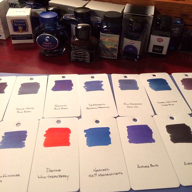
One thing I have always wanted is a visual sampling of my fountain pen inks. I have tried random sheets of paper and various notebooks but none have ever stuck. I wanted a good, thick paper and the ability to move the samples around and compare them side-by-side. Enter the Maruman Mnemosyne Word Book.

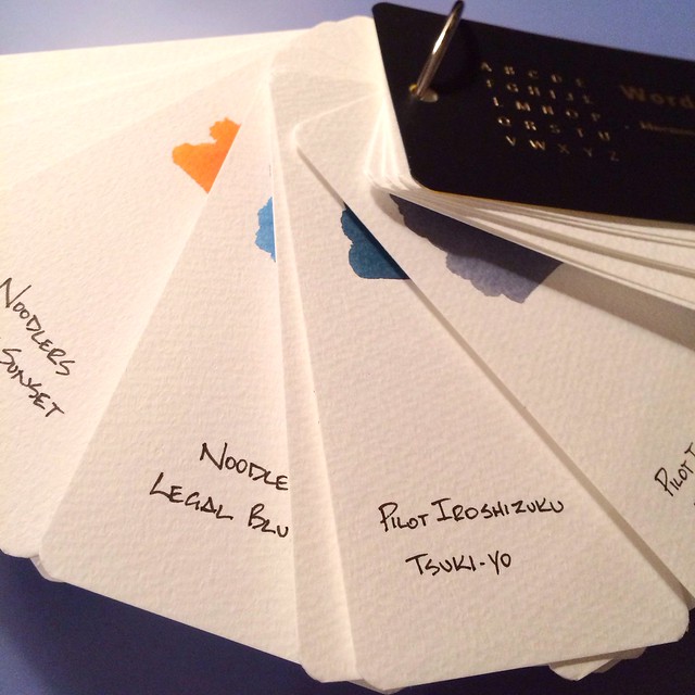
The Word Book is basically Maruman's take on flash cards. Used by students for memorization, these ringed study cards can serve many purposes. Personally, they remind me of a paint sample book and are the perfect setup for fountain pen ink samples.

Maruman Mnemosyne Word Book

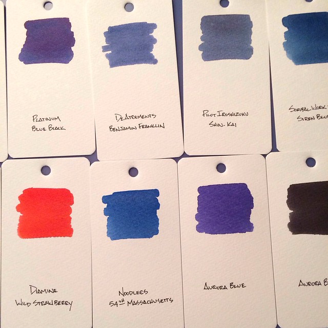
The cards are approximately 4"x2", giving me plenty of room for a large ink swab (using a basic Q-Tip dipped in the ink bottle) while leaving room for a written description at the bottom of the card. The cards are thick enough to where the large amount of ink doesn't buckle the card or bleed through. You could even use the back side for another ink sample, but I will probably use that side for ink notes.

The paper is off-white and does have some tooth to it, similar to watercolor paper. For deadly accurate color representation I will admit it is not perfect. Since the paper is so porous it soaks up much of the ink and dulls out some of the colors. It works for what I am trying to accomplish but a smoother, perfectly white paper would be a better choice.

Maruman Mnemosyne Word Book

Having the ring and pre-drilled holes is an awesome option. I can arrange the cards however I want, plus add and remove as needed. My only mistake was putting the ink sample near the top of the card. It would have worked much better if I put the ink at the bottom to where I could see them better when fanned out.

Overall, I am happy with this setup. It allows for a quick comparison of inks and is easily accessible. I have swabbed all of my ink bottles so far, and will be moving onto my sample vials in phase two. The Word Book is a great deal for under $4.00 at JetPens.

(JetPens is an advertiser on The Pen Addict and I received this product at no charge.)

Ink Links

$
0
0

-- Road Test :: XTS Titanium Pen + Stylus (EDC) (Carryology)

-- Accidental Early Review of the Nock Co. Brasstown (The Daily Carry)

-- My "Without Hesitation" Five Pens (Pen Envy)

-- Ultramarine Sheaffer Intensity Fountain Pen (Inkdependence!)

-- New Pilot B2P Pens (My Supply Room)

-- TWSBI Vac 700 (That One Pen)

-- Review: Midori Pocket & Envelope Notebooks (The Well-Appointed Desk)

-- Notebooks (Put This On)

-- The Lamy Studio (Ionsomnia)

-- Review: Rhodia Dot Pad Notepad (Gourmet Pens)

-- 2013 The Pen Year in Review (Anderson Pens)

-- Diamine Registrar’s Ink – Review (Ed Jelley)

-- Simply Red: A Review of the Franklin-Christoph M27 SE (A fool with a pen)

-- Review of Tombow Mono 100 (Pencil Revolution)

-- Lamy Pur Fountain Pen – Aluminum Smooth – EF Nib (No Pen Intended)

-- My Analog Writing Tools (Collin Donnell)

-- Diamine Eau de Nil ink review (Pens! Paper! Pencils!)

-- Camlin No:47 Piston Filler Fountain Pen (Write to Me Often)

-- Fresh Start (From the Pen Cup)

-- Kaweco ART Sport Fountain Pen - Alabaster Finish (The Clicky Post)

-- Tale of a Vandal Notebook User: Going Indie, Part 3 #Chronodex (Peaceable Writer)

-- 2013 Editors' Choice Awards - Best Office Supplies (OfficeSupplyGeek)

-- Write Notepads & Co. Large Notebook Review (THE UNROYAL WARRANT)

-- Ink P0rn: Beautiful ink bottles (these beautiful pens)

-- Notes and Books (inessential)

-- 2013 - It's A Wrap (Dave's Mechanical Pencils)

-- This Just In: TWSBI Classic (Fountain Pen Quest)

-- Review – Pilot Kakuno (My Pen Needs Ink)

-- Pen Review: Namiki (Pilot) Falcon Acrylic (The Pen Habit)

-- The three major iron gall-based inks on the market (The Five Cat PENagerie)

My Elaborate and Over-kill Notebook Archival Process

$
0
0

Real, paper notebooks. Maybe you use them, maybe you don't. You probably have a few lying around that are half full of notes, ideas, and resolutions that fizzled out. One thing that I've actually been successful at for the past couple of years (amidst hundreds of things that weren't so successful) is the self-control to actually finish a notebook to the very last page. This rule that I imposed on myself came from having too many notebooks and an unquenchable desire to buy more notebooks. Something had to give.

Skip forward a couple of years, and here we are. I routinely go through about one Field Notes book a month and consistently write in other books until they're finished. I've been very pleased with the outcome. I like opening a drawer on my cabinet and seeing a stack (or pile) of used, weathered notebooks that were my faithful companions for a spell.

So, why all this talk about finishing notebooks? Well, all these finished notebooks are what compelled me to find a way to keep these old books with me wherever I happened to be

Many times after finishing a book, I'd think of some little scrap of information that I wanted to use. I knew which notebook -- even which page -- but had no way of looking it up until I got home. My immediate solution was to make a new reminder in my current notebook to look up my inquiry when I got home and was able to get out my old notebooks. Not the greatest.

At some point, I started hearing talks of people scanning their notebooks into their computers. These solutions sounded either destructive (actually cutting out the pages to put them through the scanner), or impractical (scanning two pages at a time). I didn't want to destroy my books, and I wasn't motivated enough to stand next to my scanner and go through the process of opening the lid, turning the page of the book, aligning the book, closing the lid, pressing the button, and waiting for it to scan.

One Saturday when I was at home, I decided to photograph all my books, just as a backup. After photographing them, I had the idea of reducing the size and creating a PDF so they were easier to browse. Then, I had the best idea of the three: put the PDF files in Dropbox so I can view them anywhere from my phone or iPad. Genius.

Shortly after I started doing this, the Doxie Flip was announced. This scanner looks like the perfect solution for archiving notebooks with much less work than my process. Brad did a good review of the device that you can read.

My process is completely overkill. I did it on a whim, and I used the tools that I had at my office at my disposal. It just so happens that I'm also a freelance photographer., so I have lots of photo gear for those jobs. By no means should anyone buy the things I mention here in order to archive old books. It would be much more economical to just purchase a Doxie Flip. But I had the tools and an open afternoon, so this is what I did (and continue to do).

First things first -- the camera. It doesn't really matter what camera I'm using, but I'll tell you here. I use a Nikon D300s with a Nikkor 50mm 1.8 lens. The camera settings I used were ISO100, F11, and 1/100s. If that's gibberish to you, don't worry. Just set up the camera how you normally do to take pictures.

I use a tripod to keep the camera steady at the awkward angle required to photograph a flat object on a table. My tripod was a hand-me-down from my dad. It's functional, but some of the "perks" no longer work. The main function (holding the camera steady at a certain angle) still works, so I haven't upgraded. I've been tempted many times, but I don't use it enough to justify a new one.

Then, I set up an external flash on a flash stand to the right of the camera, although the side doesn't matter. All that matters for the flash is that it's aiming directly at the notebook and not blocked by anything else. If you don't have an external flash or a flash stand, just use the flash included in your camera.

The last part of the camera setup is the remote triggers. This will be a bit technical, so feel free to skip. I have a couple of pairs of remote radio triggers for my cameras and flashes. I normally use these triggers to move the external flash off of my camera to create artistic or dramatic light. Since the light is no longer attached to the camera, the triggers fill the communication gap so that the flash goes off at the exact moment I press the shutter button. It's a little bit of magic and always makes me smile to see it work.

I attach one trigger to the camera, one trigger to the flash, and hold onto another trigger. This last trigger stays in my left hand and allows me to fire the camera and flash without touching the camera. Pretty magical, right?

Okay, enough of the advanced photography mumbo-jumbo.

Set up the frame

The steps from here on out are pretty simple. The next thing I do is secure the notebook to the table with a couple of small strips of clear tape. I've learned that I shouldn't apply the tape very strongly to the Field Notes covers, or else they'll rip a little when I remove the tape. Just a word to the wise.

After the book is secured, I frame up the camera on the tripod and take a couple of test shots to make sure I'm not cropping off any of the edges. I also take a quick glance to make sure the photo looks good, but I always use the same settings so there hasn't been an issue yet.

Take the pictures

Here's the easiest and simplest part of the process. Snap a picture, flip the page, and repeat 23 more times. I'm usually done with a book in 30 to 45 seconds. I normally leave a finger or two from my right hand on the notebook pages so they don't flip up suddenly while I'm taking the picture. Sure, you can see the tips of my fingers, but I don't cover up any of the information. It's my notebook, anyway!

Load pictures onto computer

This section and the next section are completely optional. This is just my process. After the photos are taken, I import them to my computer with Adobe Lightroom. This is the tool that I have and feel most comfortable with for all of my photo-related tasks, so it's what I use. You can use any other program for importing and editing photos. If your camera is taking JPG files, you don't even have to do anything. Just skip to the section on Creating a PDF in Preview.

Adjust in Lightroom

After importing, I do a couple of small adjustments for my personal preferences. I convert the pictures to B&W (I don't know why -- I just prefer the look) and increase the contrast so it's easier to read.

When I'm done, I export all the pictures to my laptop drive in small JPG format. By small, I mean I export at about 30% quality to reduce the file size.

Create a PDF in Preview

Okay, the rest of the steps aren't optional. 1. Open all the jpg files in Preview and click File > Print. 2. Change the page orientation to landscape. 3. Click the PDF dropdown in the lower-left corner and select Open PDF in Preview. 4. Click File > Save in the Preview window that just opened, and save the new file as a PDF. 4. Click File > Print (again). 5. Click the PDF dropdown in the lower-left corner and select Save as PDF.

You now have a PDF with a neat, orderly collection of your notebook pages. Magic, right?

I take one additional step after this. I click File > Export and select a custom Quartz Filter that reduces the size of the PDF without degrading the readability of the file. I found that the provided "Reduce File Size" filter rendered the file unreadable. If you'd like a copy of my filter, just let me know.

An additional note -- I name my PDF files with the following convention: BeginningMM-DD to EndMM-DD YYYY

Add the PDF to Dropbox and iBooks

I'm almost done. Next, I copy or move the new PDF file to a folder in Dropbox. That folder for me is /Notebooks, but you can put it anywhere you like.

After Dropbox finishes the upload, I open the Dropbox app on my iPad and open the notebook PDF I just added. From there, I tap the export button and open the PDF in iBooks, where it will live in a "Notebooks" collection.

And that's my long, tedious process for making sure I always have my old notebooks with me. I doubt this process is for you, but I think some people will find it interesting. Even if you don't adopt the entire crazy process, you might be able to glean something useful for your own workflow.

(You can find more from Jeff online at Draft Evolution, Twitter, and App.net.)

The Pen Addict Podcast: Episode 88 - Mollycoddling

$
0
0

In this episode Myke and I discuss our stationery resolutions and wish lists for 2014. I have my work cut out for me to stay true to my list - and to my budget! I did take care of one wish list item already though...

Show Notes & Download Links

Viewing all 4319 articles
Browse latest View live